Gallery
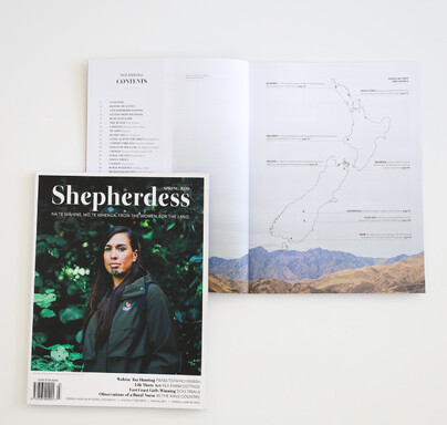
Shepherdess
Magazine
Superpowers: creative direction, layout design

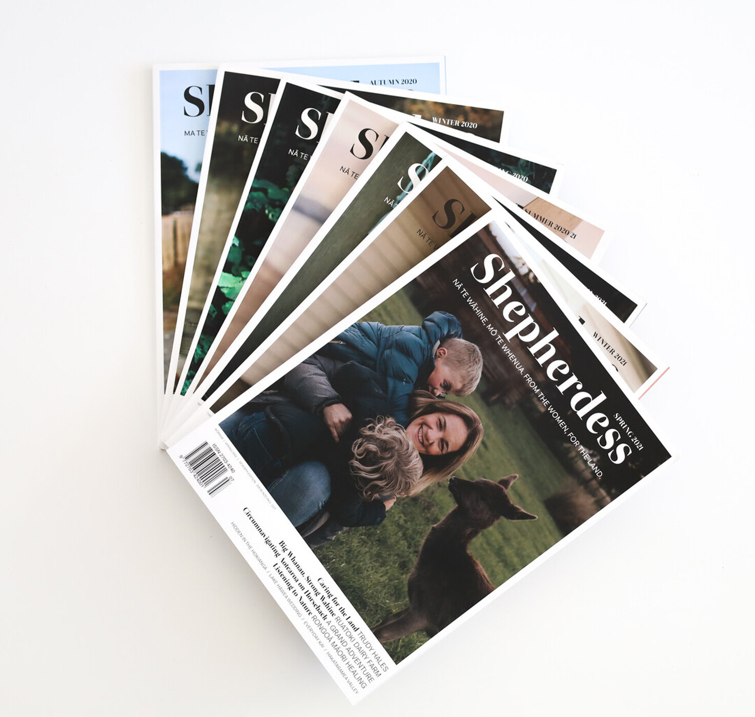
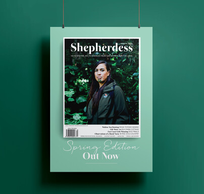
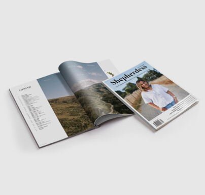
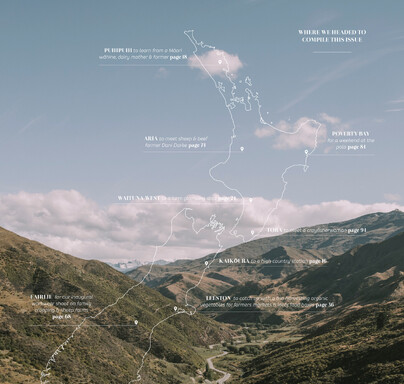
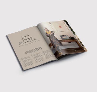
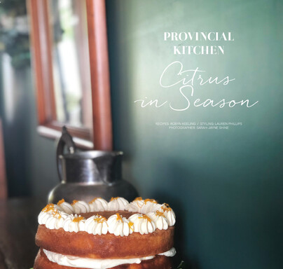
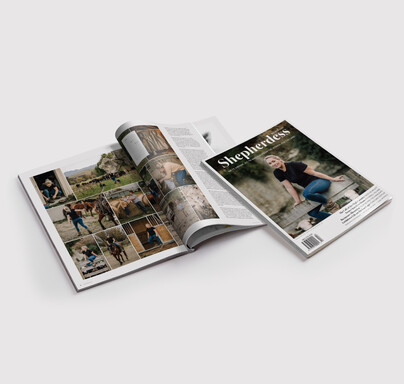
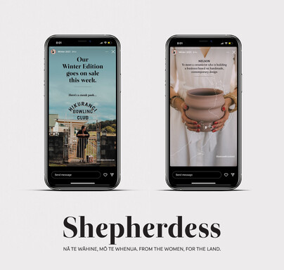
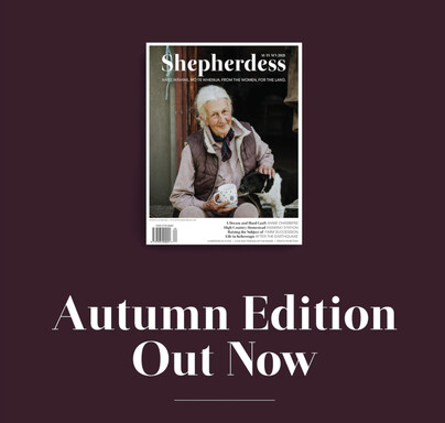
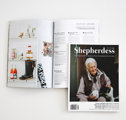
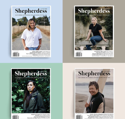
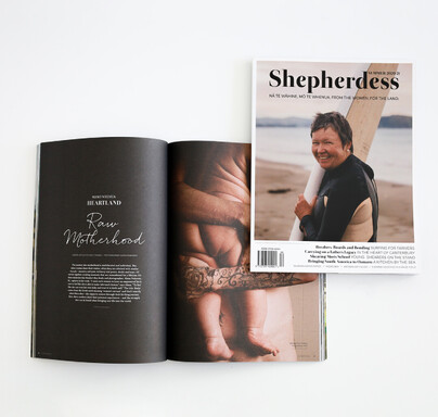
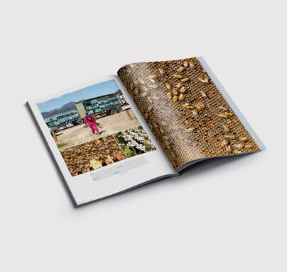
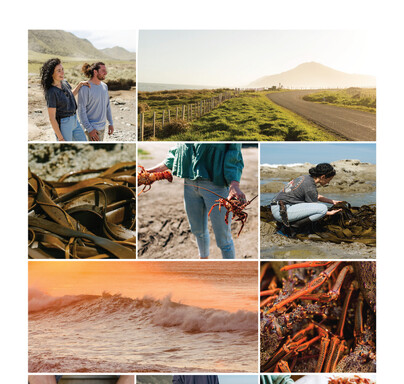
Who: Shepherdess is a quarterly printed publication that connects, empowers and inspires women across rural Aotearoa New Zealand. We were the brand partners right back to the very first edition and our creative lens has set the theme for all subsequent runs.
Brief: create the brand identity and brand assets for Shepherdess Magazine, layout design for the magazine itself and marketing for print and digital platforms
Keywords: engaging, relatable, simple, friendly, rural, high-end
Deliverables: brand identity and assets, x 6 magazines, marketing material, website and social media graphics
Kind words
"Sarah-Jayne is creative, clever, dynamic, and a storyteller. She is exactly the sort of person you want to have on your team when working on a project that uses visual communication to tell a story. She has an eye for good design, from a social media graphic, to a 100 page magazine.
The response to the Shepherdess has been heartwarming, and I believe it is thanks to Sarah Jayne’s eye. She has created a product that is beautiful, meaningful, and resonates with a rural audience. We have had such a positive response.Sarah Jayne is passionate about what she does, and this shows in every aspect of her work - when you are getting an idea off the ground, it is wonderful to work with someone who is equally as excited on a project as you! It feels like a true collaboration.
She is organised, responsive and reliable. She gets things done when she says she will. I completely trust in her knowledge of the technical details of design and getting a magazine off to print, and she can have a laugh when things don’t quite go to plan. Shepherdess would not be what it is without Sarah Jayne’s depth of talent, eye for layout design, creativity and thought."
Kristy McGregorEditor, Shepherdess Magazine

Sign up